The world’s most Louahvul newsletter goes out every Friday. Subscribe at louisville.com/newsletter.
6.18.2021, No. 59
⏱️ = 3-minute read (or so)
“Add and add and add and add” — Sarah Flood-Baumann, on her design approach to our newest issue
FIVE.
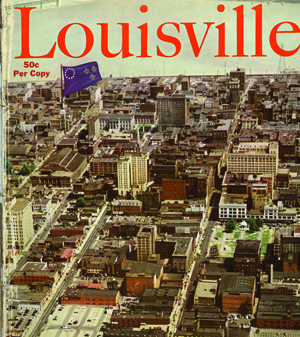
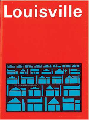
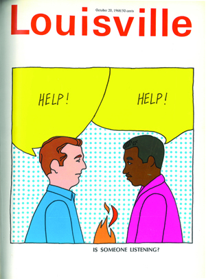
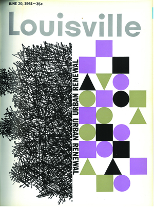
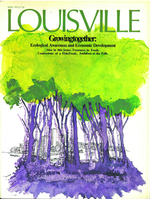
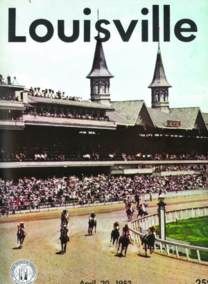
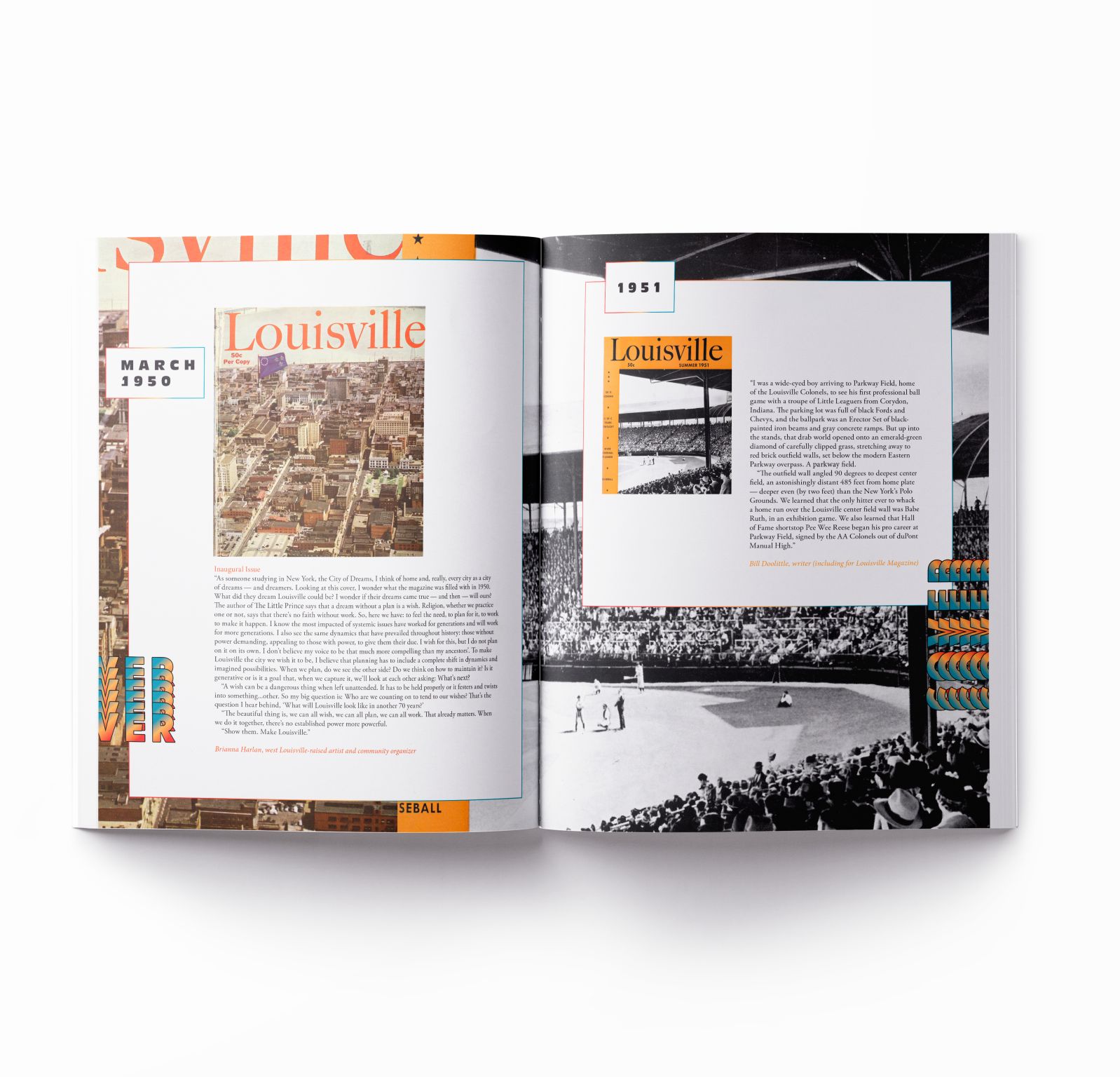
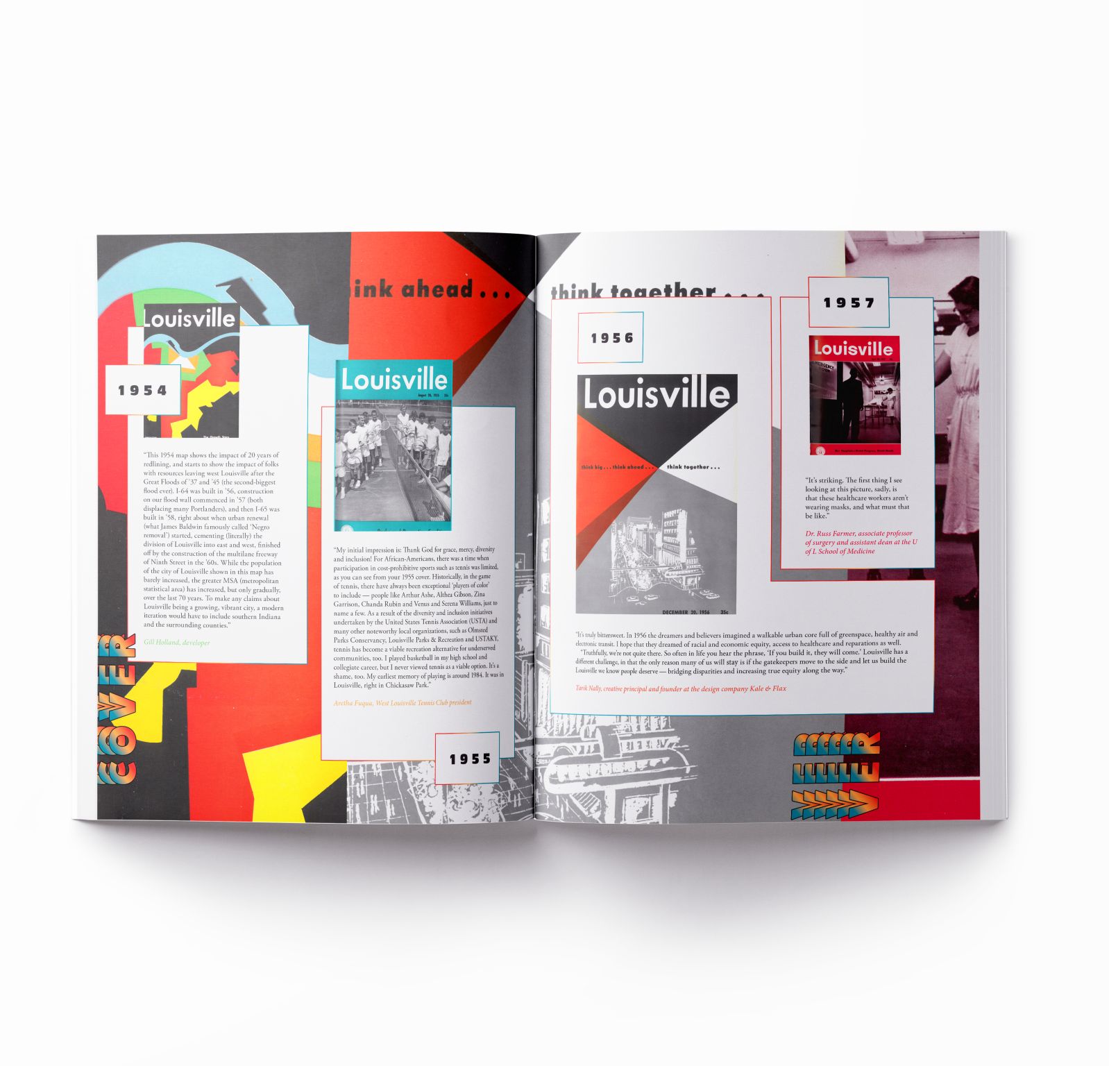
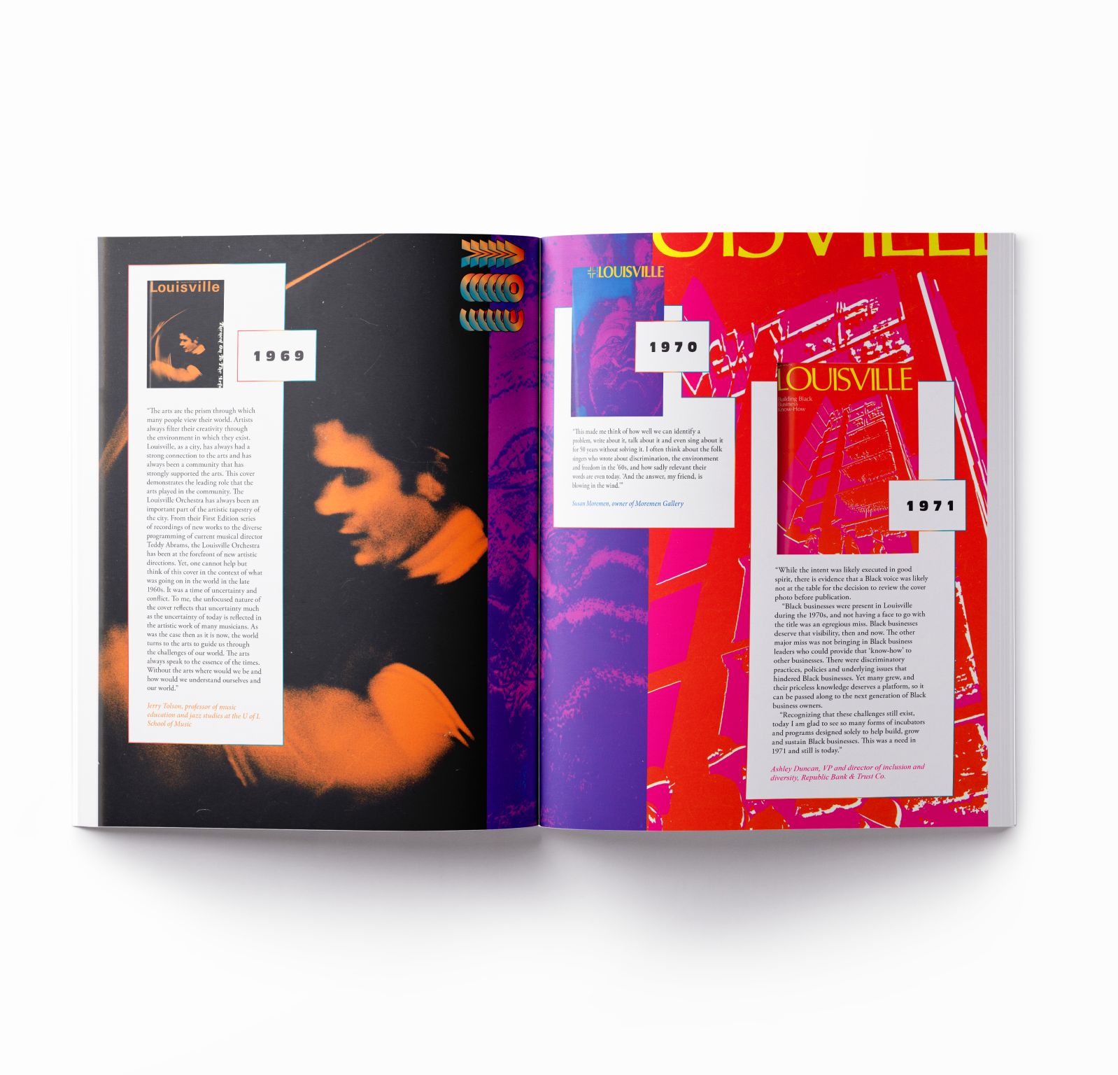
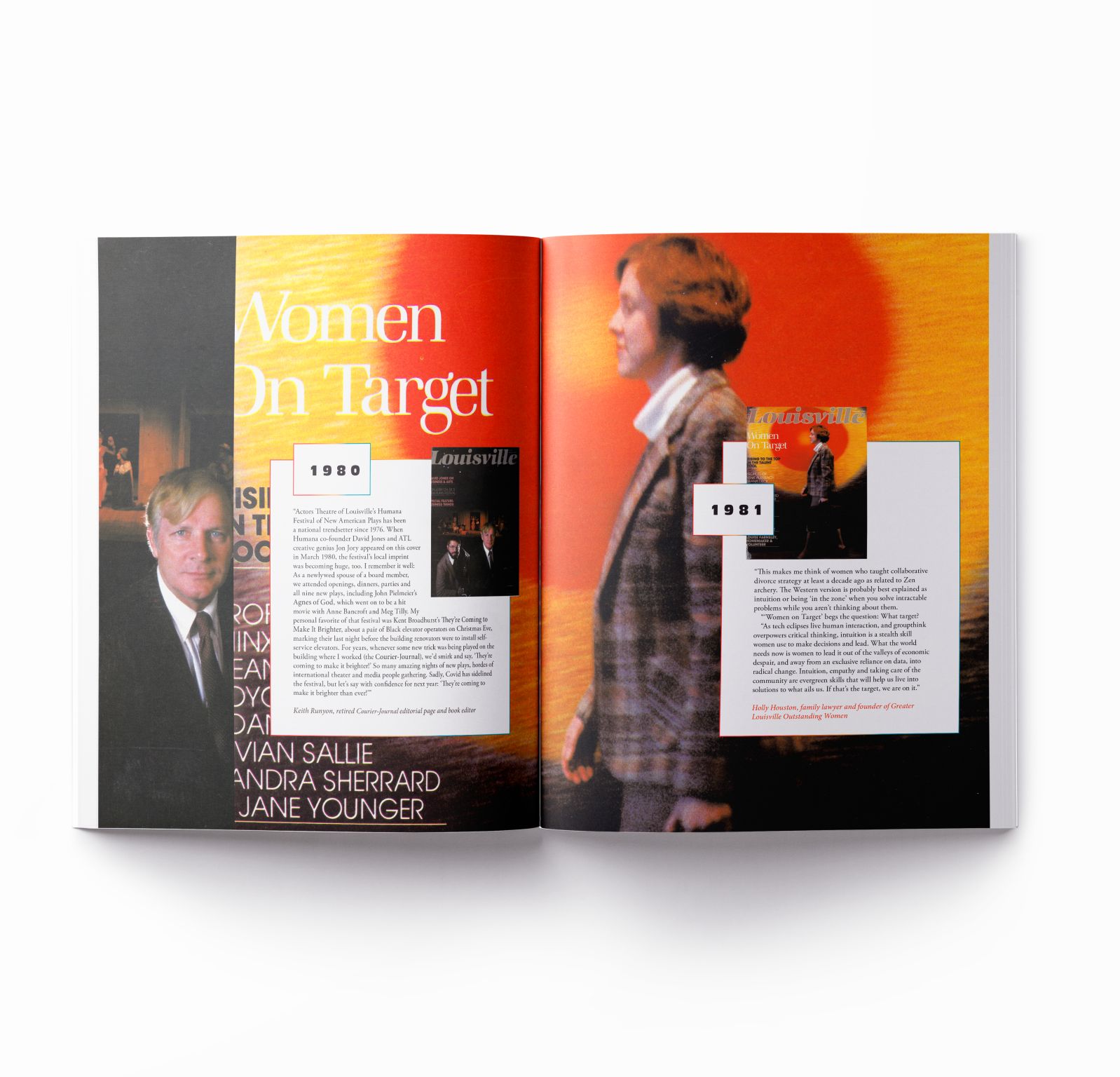
1. I hope you’ll check out our dive into the mag’s seven-decade archive, designed by Sarah Flood-Baumann for print and translated to the web by Alex Winters. This week, I’m sharing more of the 71 old covers featured inside the issue (all with commentary from locals), including this one from 1961:
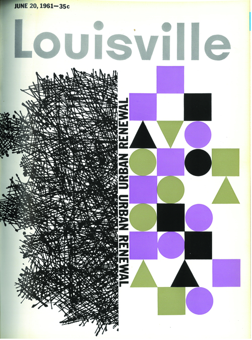
“In retrospect, we know urban renewal was urban destruction and Negro removal. This is what created the Ninth Street Divide: Black social isolation, economic disinvestment and white flight!
“I remember vividly the riots of 1968. My father’s real estate company was on 28th and Greenwood. The saddest thing for me is all the brilliant people who were born, lived and died under extreme racial oppression and never had the chance to see their talents maximized and developed.” — Kevin Cosby, senior pastor at St. Stephen Baptist Church, president of Simmons College
2.

“I think it is pretty interesting that the main topic of ecology and economic development was being discussed, an issue that could be as important today as 47 years ago, if not more so. Part of me doesn’t want to read the article, though, because I would feel pretty deflated if they discuss the very issues we are dealing with today that have not been addressed. It is why I consider myself more of an urban designer than an urban planner. I think plans have their place, but most of them end up on shelves in my experience. That’s why I’ve focused more of my efforts on tactical urbanism, placemaking and activations, which prototype and test ideas in the city’s built and natural environment. We don’t have the luxury of waiting for big projects to materialize to fill in the gaps in our urban fabric to make Louisville work for everyone, and we can’t put off fixing the ecological issues facing us, because the existential problem is a few decades away, not generations. We are the ones who need to do the heavy lifting, and that requires doing something now.” — Patrick Piuma, director of the Urban Design Studio at U of L
3.
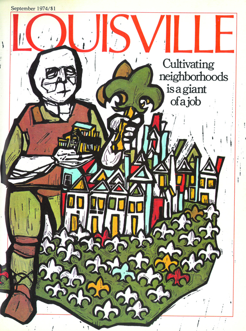
“Louisville has a real love of community that manifests at the neighborhood level. Our collective identity is really as a tapestry of individual neighborhoods, which is a more human-scaled way to think about place. This cover really speaks to that patchwork feel. It knits together the shapes and colors that make us richer. It also speaks to the stained-glass windows that are ubiquitous throughout the city. And since cultivating anything requires some heavy lifting, the giant makes a good metaphor for the work involved.” — Claude Stephens, facilitator of outreach and regenerative design, Bernheim Forest
4.
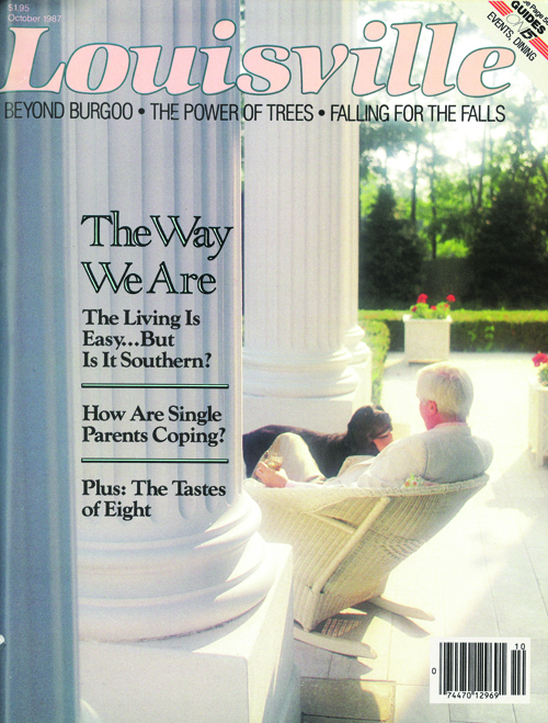
“The eternal question: Is Louisville Southern? The plantation porch would say yes, but I’ve always thought that if the city were actually Southern it wouldn’t need to wistfully ask the question each May. And the wistfulness says that we’re only seeking out the romanticized version of the South — with none of the baggage. Is Louisville Southern? Perhaps it’s not the seersucker suits we should look to for the answer, but the conflicts over Confederate monuments and the perpetuation of a Ninth Street Divide.” — Michelle Eigenheer, writer (including for Louisville Magazine)
5.
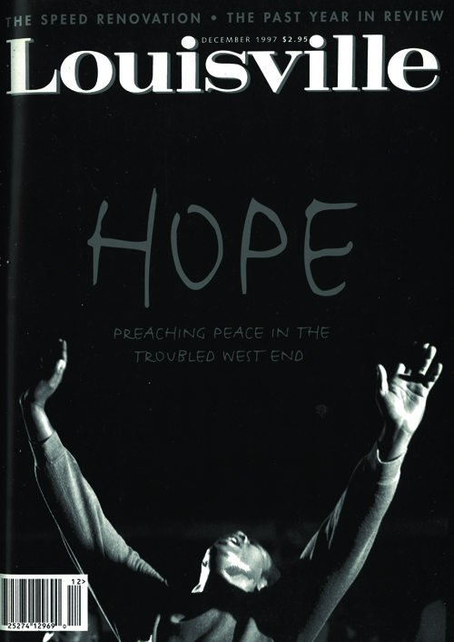
“One of the biggest challenges we face as a city is our inability — corporately, civically and as policy leaders — to understand how limited the available choices are within communities that have been economically excluded for hundreds of years. So I was struck by this concept of how ‘hope’ and ‘preaching peace’ is somehow the remedy to assure peace in the West End, as though the experiences of West End residents are attributable to their absence of hope or their desire for peace. The contrary is true. Black people, in every community, have wanted nothing more than an anchoring to hope, economic vibrancy, inclusion in the ever-elusive American dream, peace and safety in the community, and a country that is our home. Yet all of those concepts have been thwarted by current and lingering inequitable policies, choices and behaviors outside the Black community. My reaction to this cover is that it is dripping with presumptive privilege and arrogance, is misguided and dilutes the culpability that we all have in passively and actively reinforcing exclusion based on race. I am fairly confident that this cover, expressing this kind of sentiment, phrased in this way, would not fly in today’s environment as a cover for Louisville Magazine, and for that I am thankful.” — Nikki Lanier, senior VP and regional executive, Federal Reserve Bank of St. Louis, Louisville branch
OH!
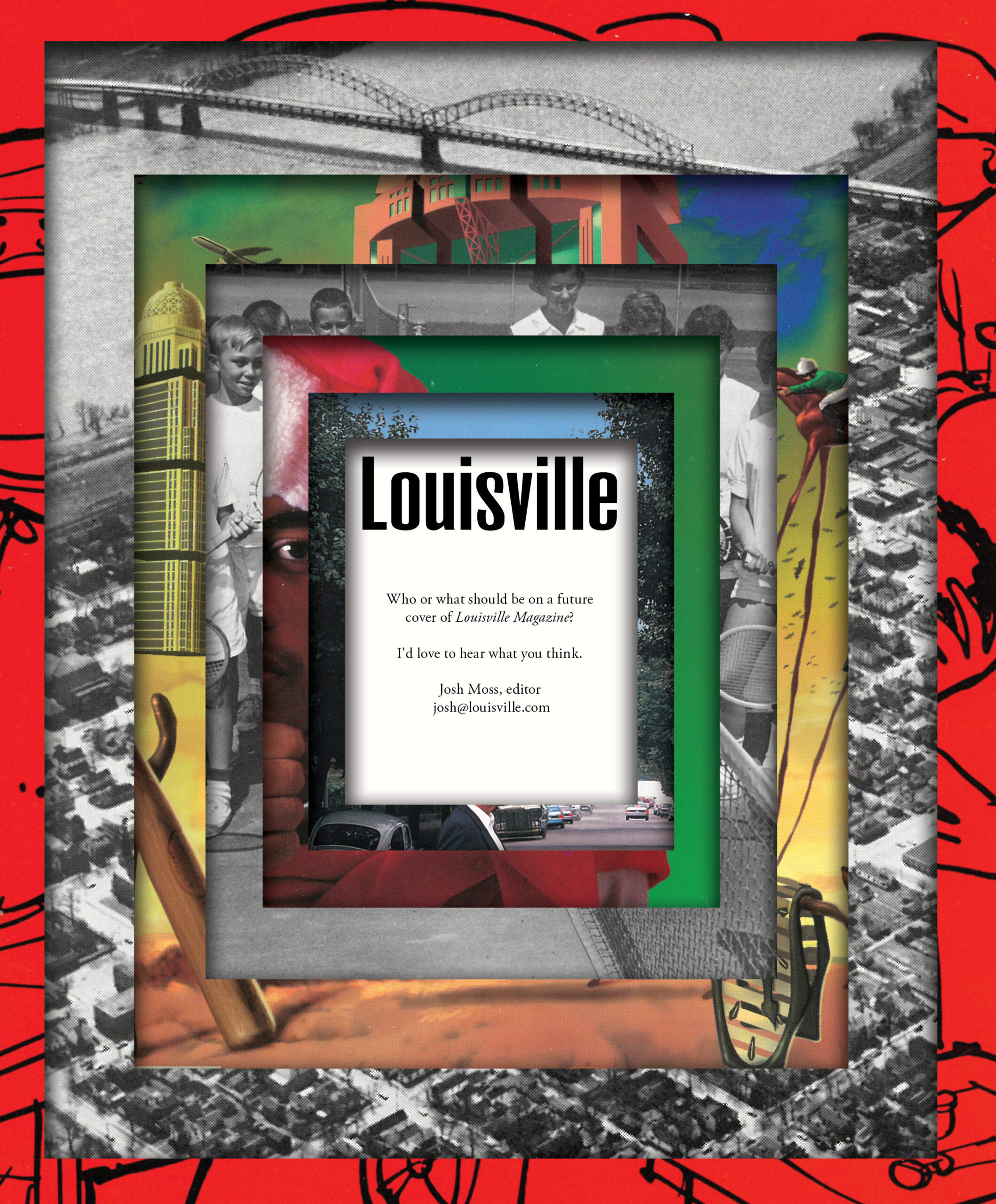
A little something from the LouMag archive.
Sarah turned these seven old covers —
— into this:
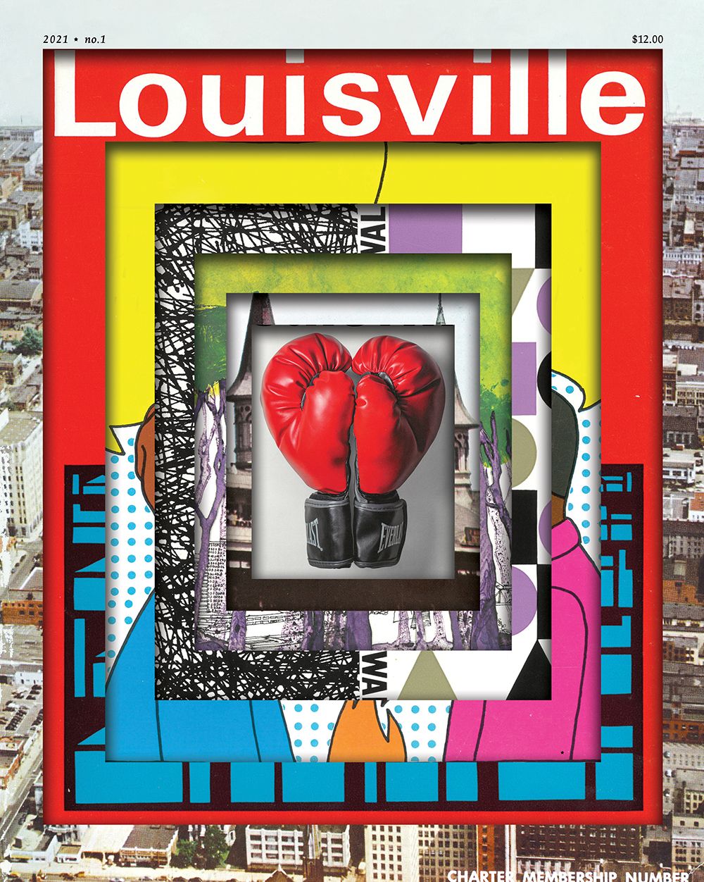
And here’s some of the inside:
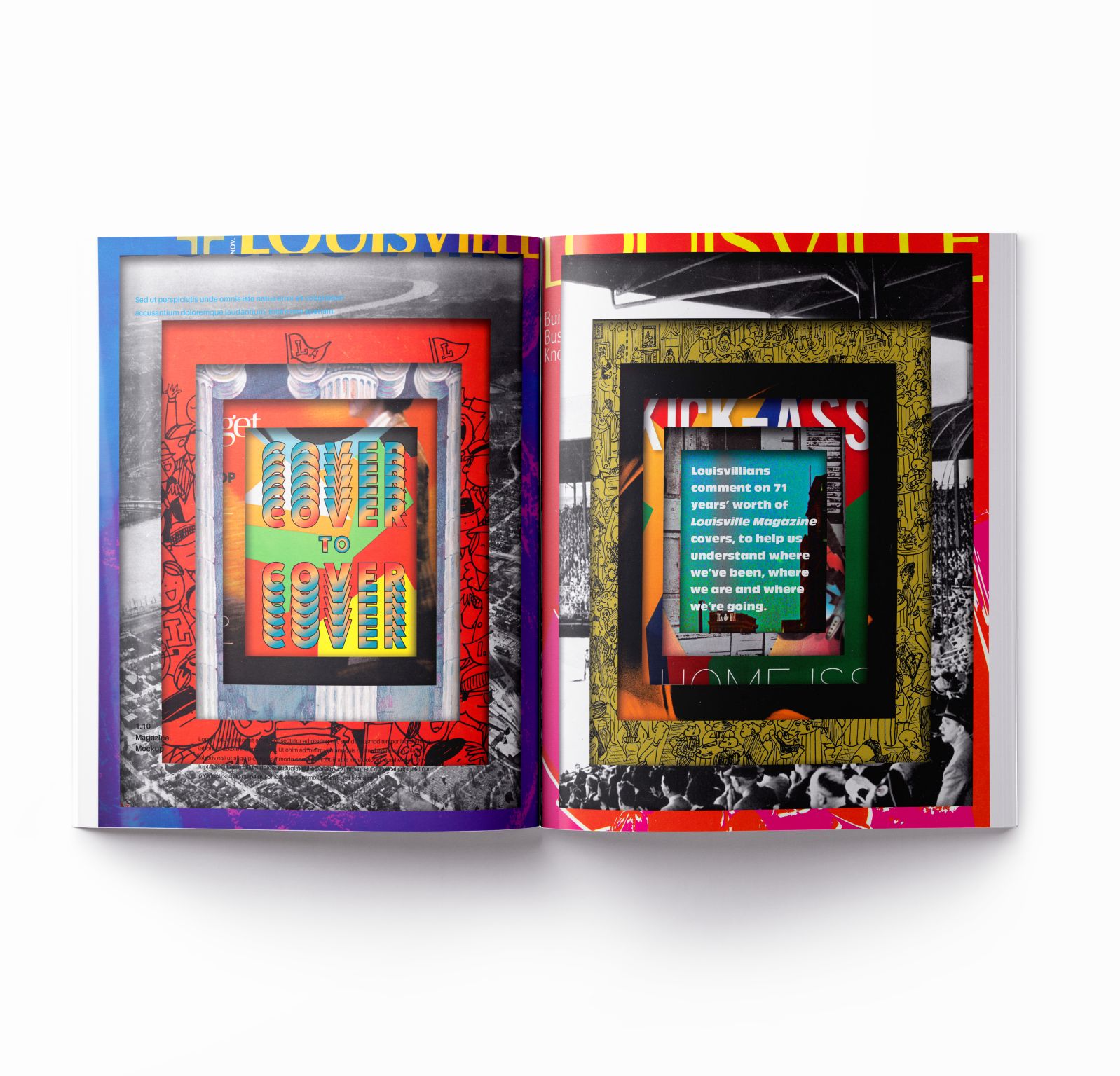
Sarah says, “The mantra for this issue was #moreismoreismoreismore. This usually isn’t my design ethos, but boy did it feel good to throw everything and the kitchen sink on the page.
“The big question was how to design a cover about covers. Super-duper meta, right?! Our archives showed us that we are stillllll writing about the same things over and over again. Housing. Derby. Green spaces. Urban Planning. Racial divides. It’s all a Twilight Zone of important topics that never seem quite solved, just evolved. We keep circling over and over again. So, using past covers, I hoped to create a tunnel, a ripple, our city’s own Twilight Zone.
“There was SO MUCH ART for this issue, and I couldn’t bring myself to use teeny-tiny little thumbnails of each featured cover. Our readers needed to see all the quirky, beautiful details. I hope blowing up and reconfiguring all the covers into the background gives the reader a chance to explore each cover. It gave me an opportunity to make a new work of art on each page.
“This issue is a lot of look. But she’s fantastical, playful and full of nuances and details that the eyeballs can straight FEAST on. It felt so refreshing to add and add and add and add. Happy reading, y’all!”
TOO…
Read past newsletters here.